
KAIKEHA
Kaikeha is a 501 (c) (3) non profit with the mission to engage the youth of Hawai’i in water sports activities to foster a lifelong connection with the ocean by nurturing a competitive athletic spirit.
Problem: To design a logo that can be used for organization that helps visualize what Kaikeha stands for.
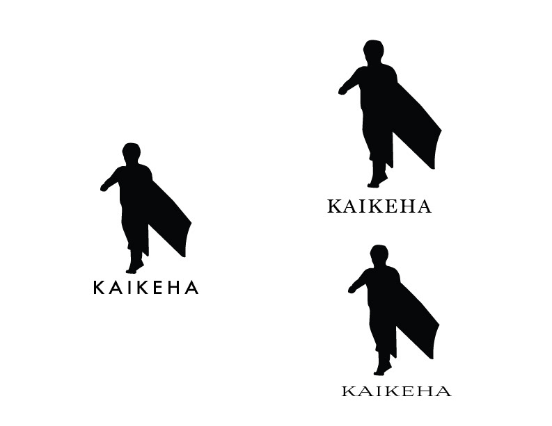
This first concept was focused on the youth focal point of the organization.
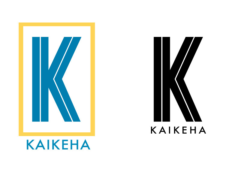
With this concept I was more focused on the strength that stands behind the meaning of KAIKEHA. I wanted to create a mark that was solid yet readable and recognizable.
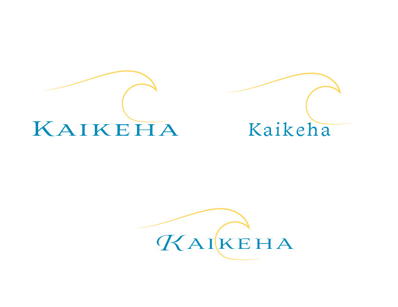
This last set of mark variations was tieing in the ocean and wave riding focus of the organization.

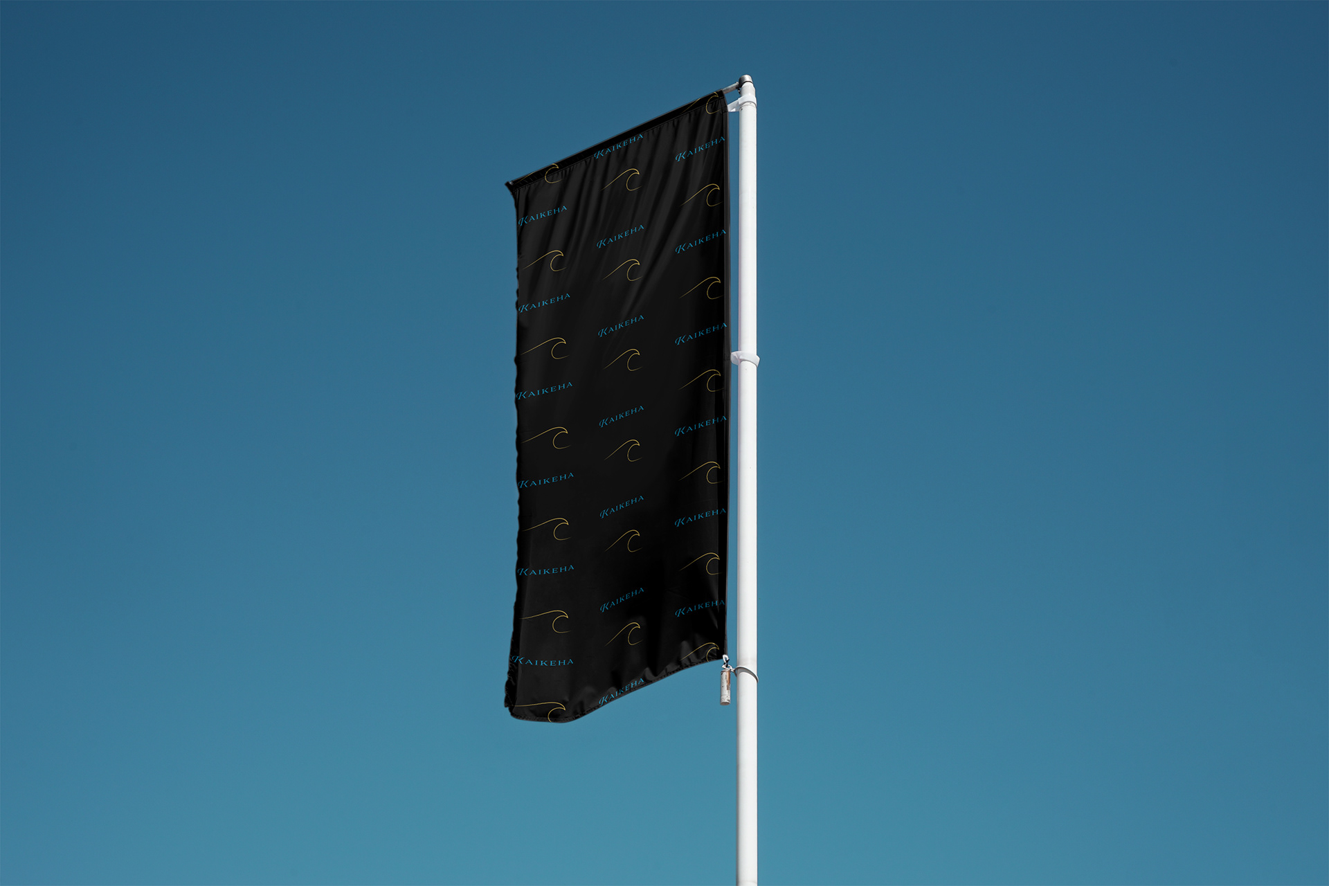
KAIKEHA is a word that is really 2 words put together. KAI means ocean and KEHA means regal. With this in mind the final mark was chosen. The blue color of the word to stand for the ocean and the gold in the wave to stand for regal. With the wave splitting the word to further create awareness of the combination of words, that stand for the regal ocean.