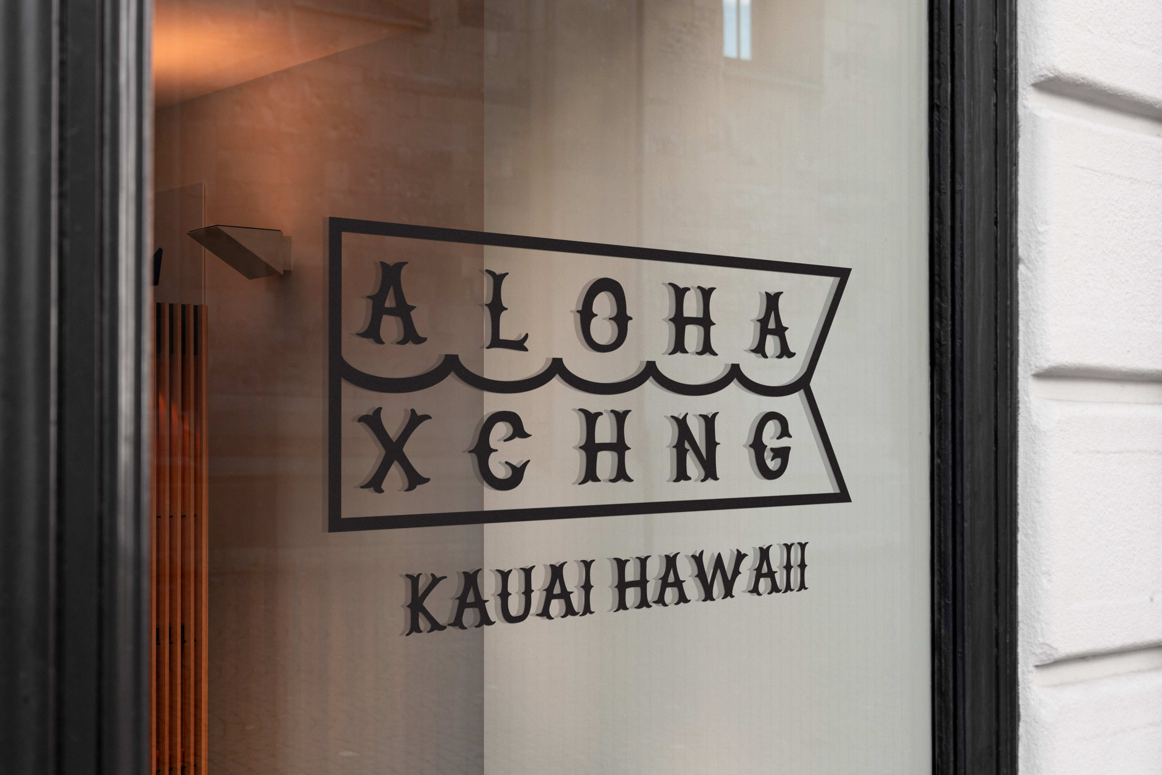
I worked at Aloha Exchange in 2013. My role was to design the logos for tee shirts. The basis was that it was a nautically inspired surf/skate shop. The goal was to move away from the traditional look of a surf shop. While there I created the Aloha Exchange Regular typeface to speed up the process of design and to make sure we had a consistent look and feel across the brand.

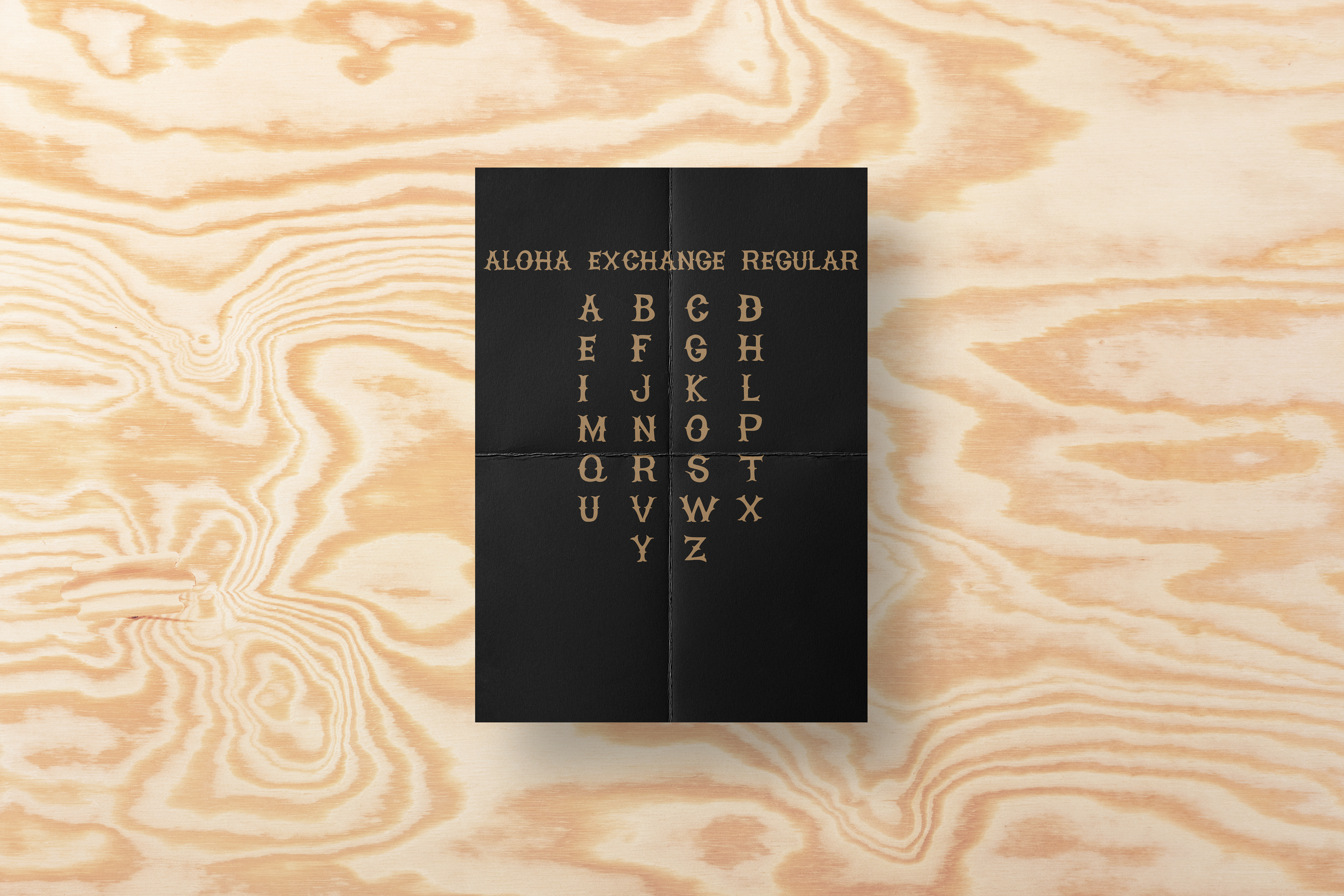
ALOHA EXCHANGE REGULAR
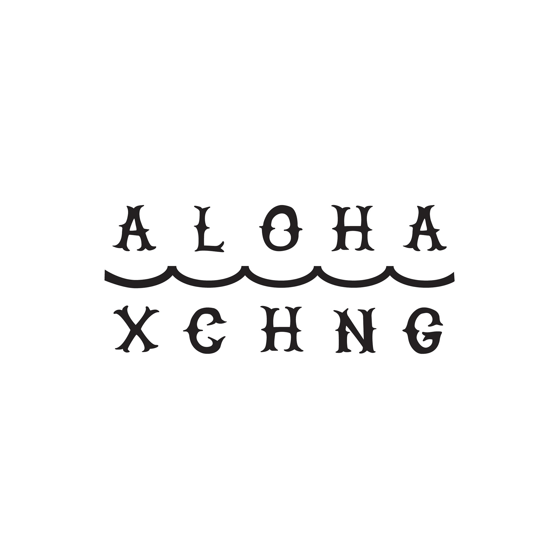
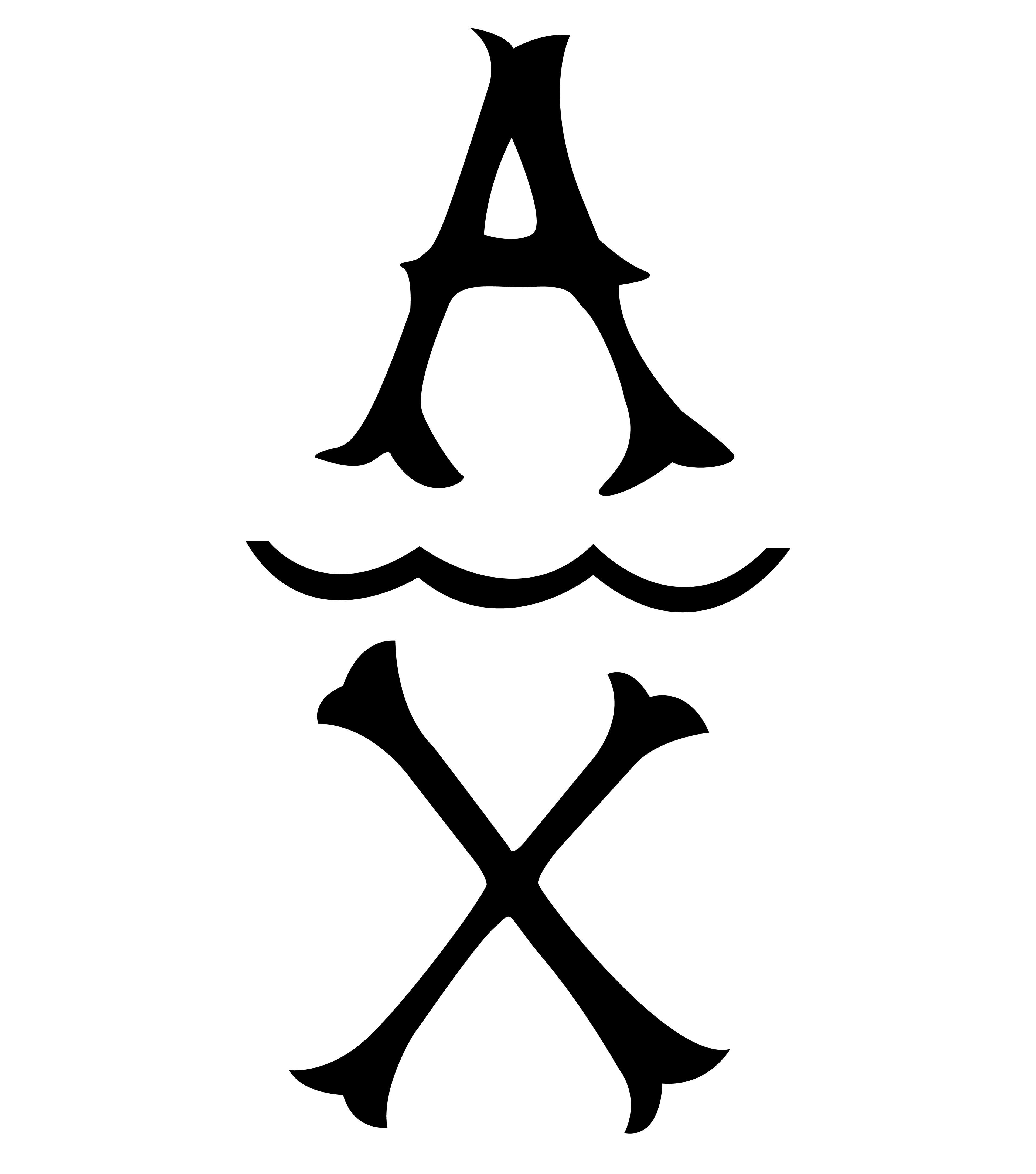
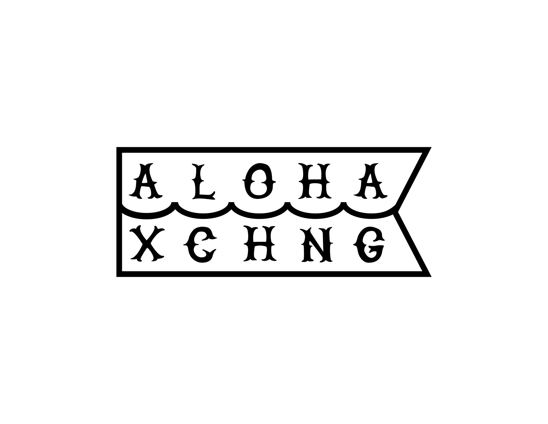
These were 3 of the foundational logos that were used during my time at Aloha Exchange.
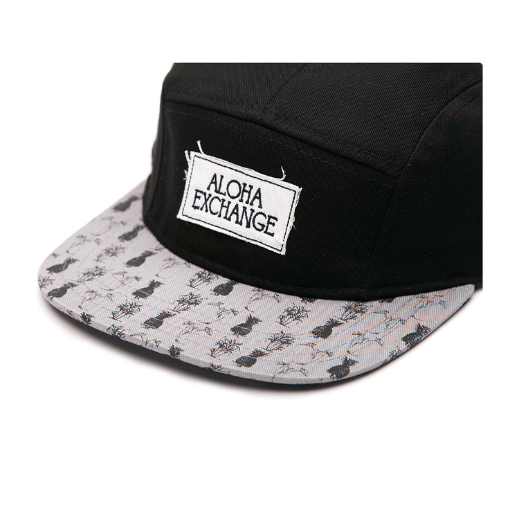
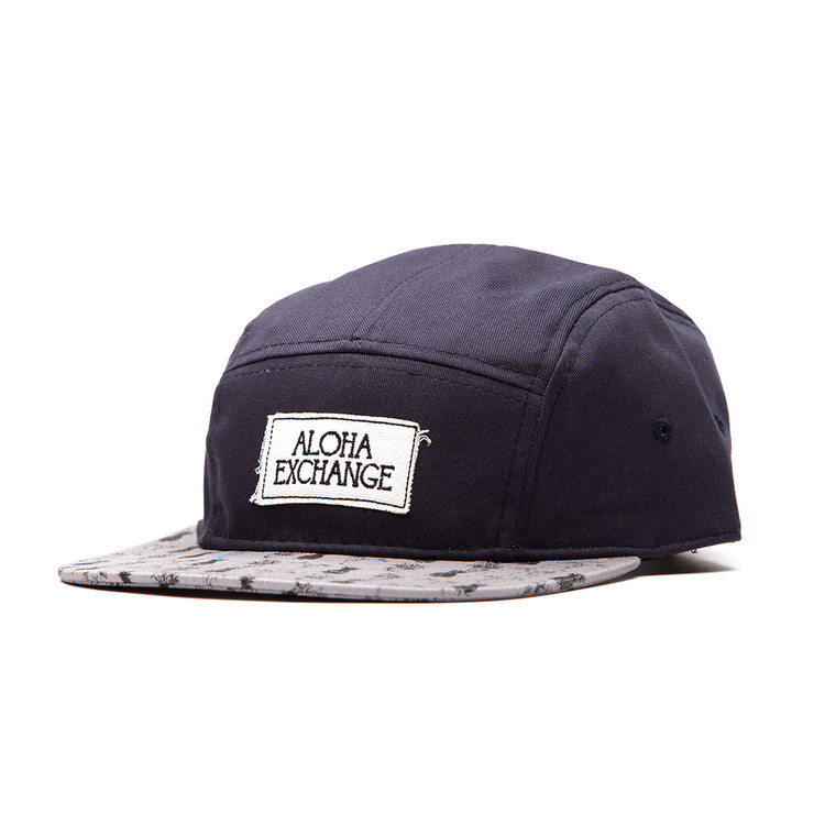
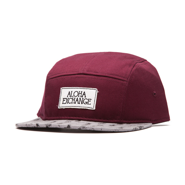
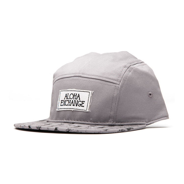
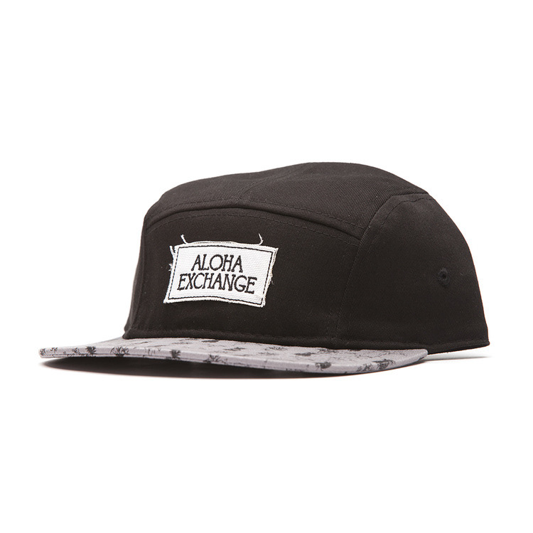
The Aloha Exchange Runner Hat - For this product there were 3 aspects that needed to be created.
1. The patch that would be sewn on the front of the hat.
2. The brim pattern
3. The inside tag (not pictured)
For the patch we agreed to do something simple and legible that spelt the brand name out entirely. The Brim was a pattern that used 3 icons of Hawaii: Pineapple, Sugarcane and Taro.
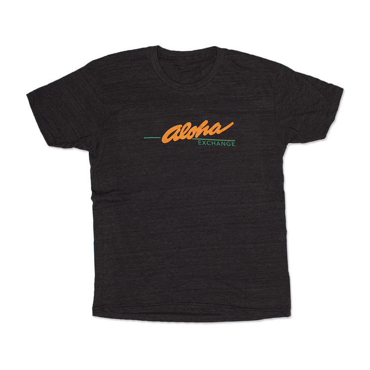
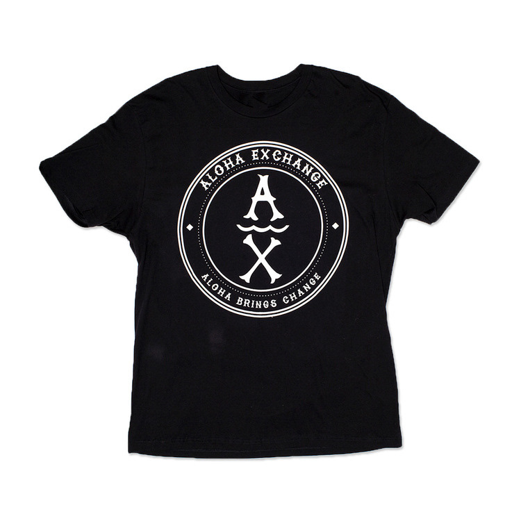
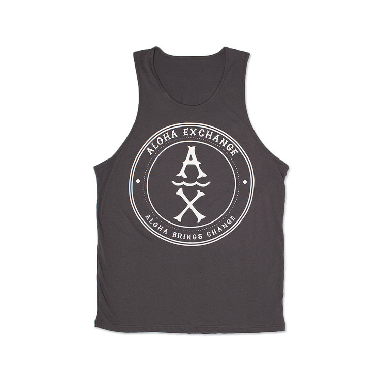
Aloha Exchange Tee Shirts - Here are 3 examples of the tee shirts I designed while I was there.